One common question we get asked a lot is "when I print photos, which colour space I should use? CMYK or sRGB?". Our answer is neither. If you are serious about your photography work and you want to know how to get the best colour out of your photos, this article is for you.
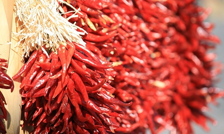
Table of Contents
What's Colour Space?
Let's start with a quick introduction on colour space.
Colour space is just a collection of visible colours. The following image shows the colour spaces for human eyes and ProPhoto RGB. (If you shoot in Camera Raw, ProPhoto is the colour space you've been using.) The colourful area represents all the colours we can see with naked eyes and the triangle area represents the colours our digital cameras are capable to capture.

You'll notice that there are some colours our eyes can see but the cameras cannot handle, particularly the turquoise colours on the top left and some of the purple/pink ones at the bottom. Similarly, the camera can capture some colours that we can't see.
So what happened to the colours the camera can't deal with? The short answer is they are lost. And this is why sometimes the photos come across a bit "flat".
Why not CMYK?
Isn't CMYK designed for colour printing? It turns out that CMYK has a very narrow colour space. Check this out.

What this means is that significant amount of colours gets lost when you print your photos using CMYK.
Why not sRGB?
Similar to CMYK, sRGB has a relatively narrow colour space. Both technologies were designed in the early 80s and they are more 30 years old now!

How about AdobeRGB 1998?
Great question! And we are really getting to the exciting part now.
Adobe RGB 1998 was designed to contain most of the colours achievable on CMYK printers, using only RGB primary colours. Adobe RGB is considered to be the default colour spaces in digital photography. But with the development of modern photo printers, Adobe RGB has shown its age.
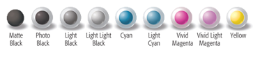
To address the narrow colour space issue in CMYK, modern professional photo printers have added more colour to the mix. For example, the Epson ink set we have in our workshop take in 8, instead of 4, ink cartridges. Here is a photo of all the cartridges we are using.
In fact, the professional printers now supports a wider colour space than Adobe RGB.

Allow this to sink in. If you store your photos in Adobe RGB, you might be doing it wrong!
Digital Workflow - Colour Space Best Practices
Digital workflow is a complicated topic that deserves an article of its own. But here are a few key takeaways related to our discussion.
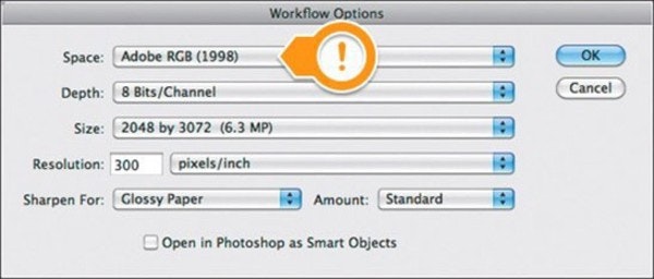
Always shoot, store and edit photos in ProPhoto colour space. Since ProPhoto exceeds the colour space of human vision, it’s unlikely that you’ll ever need a wider editing space than ProPhoto. If you create your files in ProPhoto you’ll be well positioned to take advantage of future advances in printer and media technology.
Storing digital photos in Adobe RGB instead of ProPhoto is the number one mistake a photographer can make in digital printing.
Here is how to set it in Adobe's Camera Raw.
What's Colour Profile? How to use it?
Once you've edited the photos in ProPhoto colour space and you are ready to print, you need to convert the photos' colour space into the colour space of the final print media. To do this, you'll need a colour profile.
Colour profile is a custom colour space defined for a particular printer, ink and paper type combination.
Colour profile makes it possible for you to see what the final prints might look like on your monitor. This print emulation step is very important because you'll be surprised that even with the same photo, the prints can be quite different when printed onto different paper types.
You can download our colour profiles from the ICC profiles page. As you'll see, we provide one colour profile for each product because we use a different printer, different ink set and certainly different paper stock for each product. You can find video instructions on how to install colour profiles for windows and Mac. (Pro Tip: Here is a litmus test. If you use a local printer, ask for a colour profile. If they can't provide one, maybe you should go somewhere else.)
Once you have the colour profile in place, the next step is to convert the photo into the target colour space. In Photoshop, use Edit > Convert to Profile .... This should change the appearance of the colours as displayed on your monitor.
Once the conversion is done, you might want to make some minor tweaks so that the prints look close to what you have in mind. And now you can feel confident to export the photo into JPEG and send to your favourite printer.
We hope you find this article helpful. We understand that this is a quite technical topic. If you have any questions, please leave a comment below. We will respond to them as soon as possible.